Using heuristic evaluation to inform the user experience strategy of a product
Analytics products such as OpenSearch rely heavily on visual interfaces such as dashboards to communicate the meaning of data to end users. These products offer powerful tools to construct visualizations, and it is crucial that the user workflow is both intuitive and smooth.
Of the different research methodologies that a product team can utilize to improve their dashboard offerings, conducting a heuristic evaluation to help inform the user experience strategy can be valuable. This research method helps amplify the benefits of best-in-line research methodologies and helps inform product improvement recommendations.
Conducting a heuristic evaluation is significantly more cost effective than methodologies involving user samples and can often be performed by internal teams on an ongoing basis. The ultimate value of this methodology is that it can be executed quickly, highlight actionable feedback, and help shape the user experience strategy. This method is not a replacement for primary research but is a valuable tool in any organization’s mixed-method research toolkit.
The OpenSearch Project recently partnered with Steyer Insights to conduct a heuristic evaluation of OpenSearch Playground, with a specific focus on identifying gaps that a new user might encounter when getting started with OpenSearch.
Conducting a heuristic evaluation
A heuristic evaluation is a usability inspection method that helps identify issues in a UI design. Evaluators examine the interface and assess its compliance with a set of guidelines, called heuristics, that make systems easy to use. Heuristic evaluations are used to improve the quality of UI design early in the product lifecycle.
We wanted to conduct a heuristic evaluation of the OpenSearch Dashboards experience. To do this, we applied two frameworks: UI Tenets & Traps and Nielsen’s 10 Usability Heuristics.
UI Tenets & Traps is a framework that detects common UI design errors that can affect the user experience, such as invisible elements, poor groupings, and uncomprehended elements.
Nielsen’s 10 Usability Heuristics are general guidelines for UI design, such as visibility of system status, error prevention, and user control and freedom. These methods help in developing a UI that is easy to use, intuitive, and meets the needs of the user.
UX heuristic evaluation: OpenSearch Playground
The goal of this research was to produce a document that not only identifies the tenets, traps, and UX heuristic violations of OpenSearch Playground but also offers the product and UX teams immediately actionable insights.
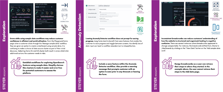
To improve the UI/UX of OpenSearch Playground, we tried to view the product through the fresh eyes of a new customer. To do so, we deployed the research principles of a UX heuristic evaluation. As a result of this process, we identified four key recommendations. These recommendations are informed by the most commonly identified violations of tenets, traps, and UX heuristics and are summarized below.

-
Focus on workflows that help customers achieve a goal rather than complete specific tasks. The OpenSearch Playground home page points customers toward concrete tasks like ingesting data, exploring data, and trying a query assistant. Consider organizing the site to support customer goals such as proactive anomaly monitoring, data visualization, and getting started with minimal expertise.
-
Use consistent terminology and workflows across all tools and features to help customers work faster and build intuitive mental models. There are several instances where the experience changes depending on whether users are logged in or not. There are also instances where terms are used that differ from industry standards, like “buckets.” Simplifying terminology and workflows to follow industry best practices will increase customer confidence in the product.
-
Minimize available actions in OpenSearch Playground that trial users cannot access. A recurring Tenet & Trap violation was Inviting Dead End. Users encounter options (for example, “add sample data”) that they do not have access to and are unable to perform. Focusing on eliminating these encounters and errors makes it easier for potential customers to assess the product.
-
Investigate potential content gaps on OpenSearch.org that may hinder a new user trial. The website appears to have information gaps that add friction to understanding and trialing OpenSearch Playground.
Takeaways
- Perform a heuristic analysis to rapidly identify common traps and violations in your product design.
- You can scope your research as broadly or narrowly as needed.
- UX heuristic insights are often universally applicable to your entire UX; be sure to broaden your understanding (and dissemination) of your findings to ensure maximum derived value from your efforts.
- You can engage outside UX research experts or utilize existing resources to apply these UI Tenets & Traps and Nielsen’s 10 Usability Heuristics to your product.
- Implement a regular heuristic research practice to monitor and track improvements.
About Steyer
“We don’t just analyze data, we create meaning from it. We don’t just report insights, we inspire action from them.”
Steyer partners with our clients to make meaningful connections between people and information, solving our clients’ business problems with the tools we know best: strategic analysis, user research, and the creation, organization, and revision of business content. With nearly three decades of delighting both our clients and our own team members, we understand what it takes to effect real change in the real world.


