


Improving ease of use in OpenSearch Dashboards with Vega visualizations
Improving ease of use in OpenSearch Dashboards with Vega visualizations
When we offer users a clunky dashboard interface, we increase usability pain points and user frustration. Improving the usability of software requires a sharp focus on user experience. Moreover, a poor interface restricts customizability, a prized requirement by high-code users. There are, however, ways to work around these hurdles in order to give users, especially those dependent on a UX to understand data (low-code users who are very sophisticated in comprehending data), an easy dashboard experience.
Take Vega, for example. Vega is a powerful language for creating custom visualizations, and its integration with OpenSearch Dashboards enables users to craft complex and highly customized charts and graphs that go beyond standard visualizations. It allows users to create dashboards with enhanced aesthetics and visuals with a granular level of control. This flexibility is particularly useful for visualizing intricate datasets or when enhanced visualization formats are required. The beauty of data is that it lends itself to multiple modes of understanding. Users grasp data conceptually without any sensory assistance.
At the same time, users can understand data using basic human senses. An example of this is seeing two apples (visual perception), tasting a tart orange or a salty pretzel (taste perception), listening to A0 versus C8 notes (auditory perception), touching your pet or a rock (touch perception), or smelling your shoe or the fragrance of lavender (smell perception). As humans, we are programmed to perceive, and this helps us to understand the world. When we have confidence in what it is that we perceive, we feel confident in what we think we understand. When we are confident in what we know, we have high certainty in what we communicate to others. This helps us make better decisions. More importantly, it helps us communicate more crisply and with more certainty. In the context of dashboards, a more in-depth understanding of data is a powerful persuasion tool. Noted above are constructs that help with data comprehension. When the coefficient of correlation is high between two variables, we have high certainty in the relationship between the two variables. We can communicate this better by showing a scatter plot with a tighter spread. Communicating visually helps us navigate information quicker.
It enables what in cognitive science we refer to as fluency. Fluency refers to ease of processing or thinking. At some point, processing stops, and we determine that we have understood what we have perceived. When information is assimilated in digits or numbers (basic statistical formulations such as mean, median, etc.), processing takes longer than when information is presented visually, like in a bar graph. Perceptual processing aids instantaneous comprehension as opposed to conceptual comprehension. Someone interpreting data has an enhanced sense of ease when they comprehend data perceptually. This is fluency. Fluency is not restricted to one visualization. Users can also perceive a sense of ease when navigating between visualizations. A juxtaposition of visualizations that fail to communicate a narrative hinders fluency. A well-composed and logical set of dashboard visualizations increases the feeling of ease and fluency when comprehending data. This ultimately helps dashboard users to make better decisions.
How can OpenSearch Dashboards help?
OpenSearch Dashboards offers a scalable, user-friendly interface for searching, analyzing, and visualizing data in nearly real time:
- Scalability: Manages large-scale data distribution across clusters of servers seamlessly.
- Real-time processing: Delivers near-instant search results and data analytics.
- Flexibility: Accommodates various data formats and sources, including logs, metrics, and traces.
- Analytics: Executes complex queries and analytics through sophisticated aggregation capabilities.
- Integrated visualization: Includes ready-to-use visualizations and integrations designed to improve performance and usability and provide tailored solutions for observability use cases.
As the above makes clear, the visualization and representation of data must be very accurate and informative.
This brings us to the following question: What tools do we offer for effectively composing visual data representation?
Today, our primary method of creating visual data representations is querying indexes and presenting the results. The query can be composed of a search with filters and aggregations. In many cases, you may want to combine multiple query results into a single coherent visualization, and this is where Vega can help.
Vega uses the concept of datasets, where each dataset is built using a separated query and therefore allows the visual rendering step to manipulate the collection of datasets to present a unified conclusion.
Because Vega is essentially a toolkit for general-purpose data visualization, we have taken the challenge and created a catalog of predefined and opinionated visual components that match a list of domain-specific use cases. These use cases are grouped into a catalog, and the community may compose and enhance them according to their specifications and requirements.
The catalog repository contains these domain-specific visualizations and allow the seamless installation of the following components
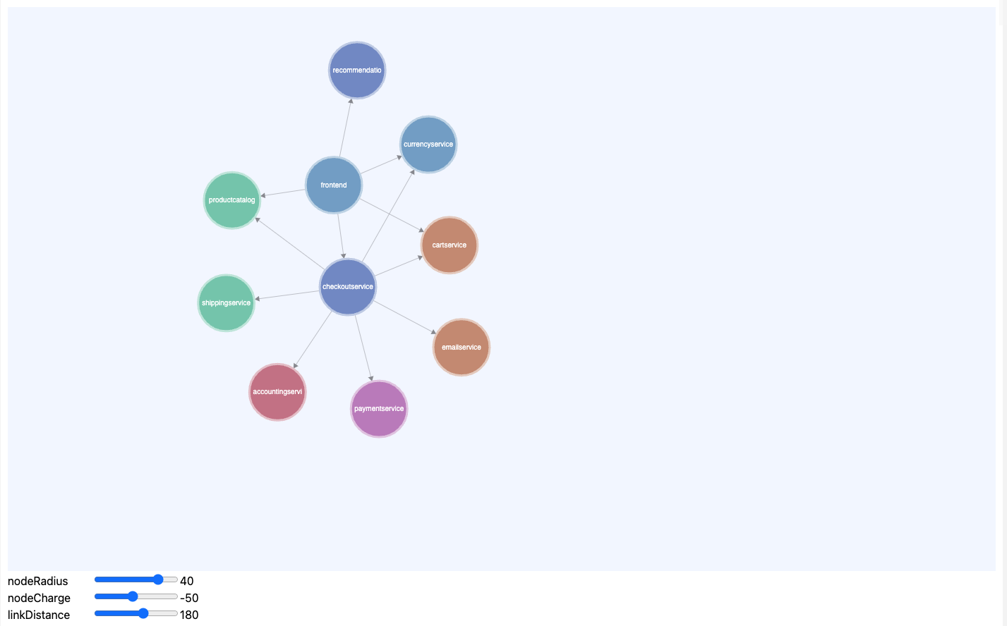
- Service Map Widget
- Instead of having a static image of a network you can create a dynamic map that is reflective of multiple dimensions of severity of an incident
-
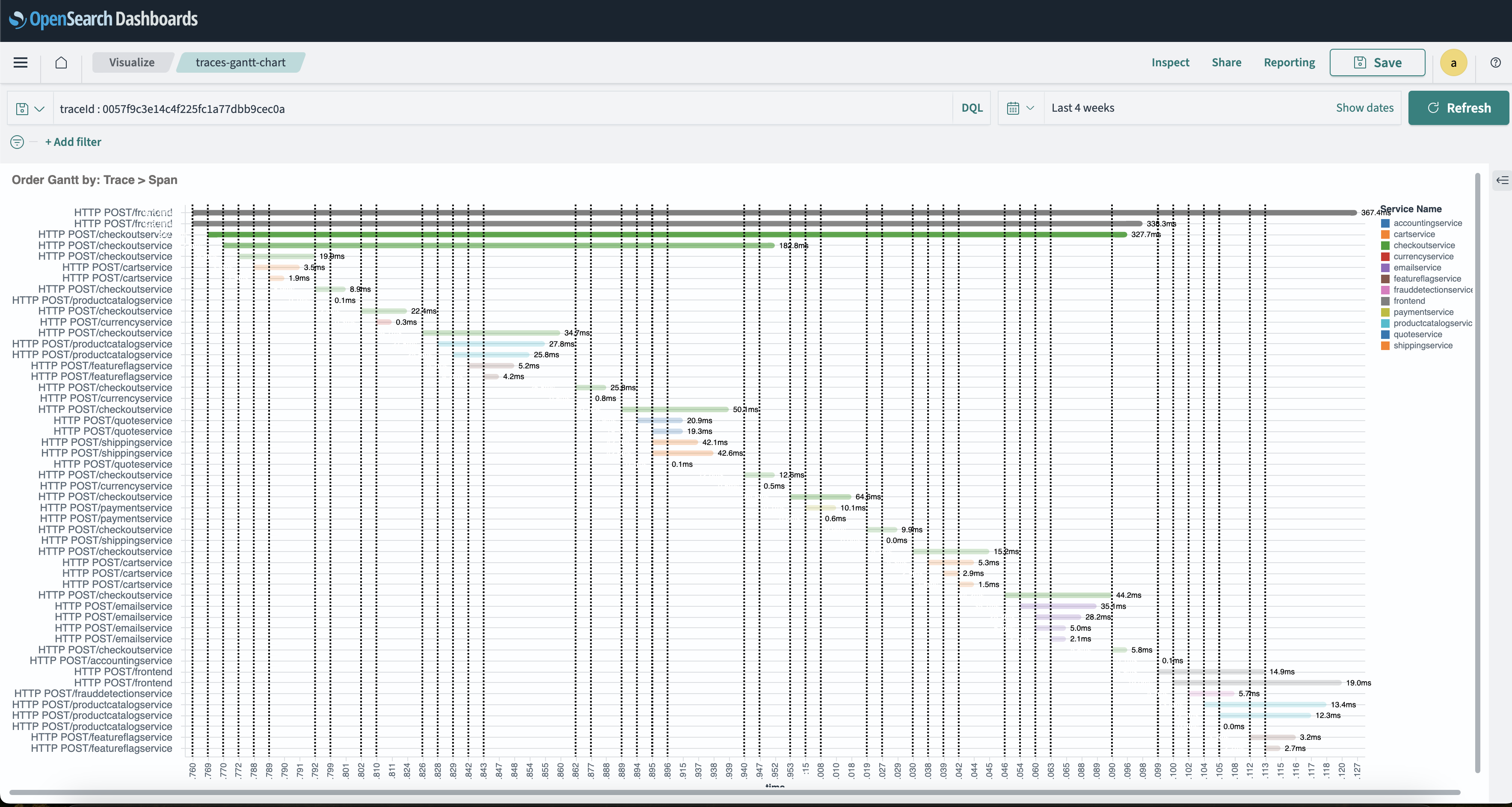
- Trace Gantt Widget
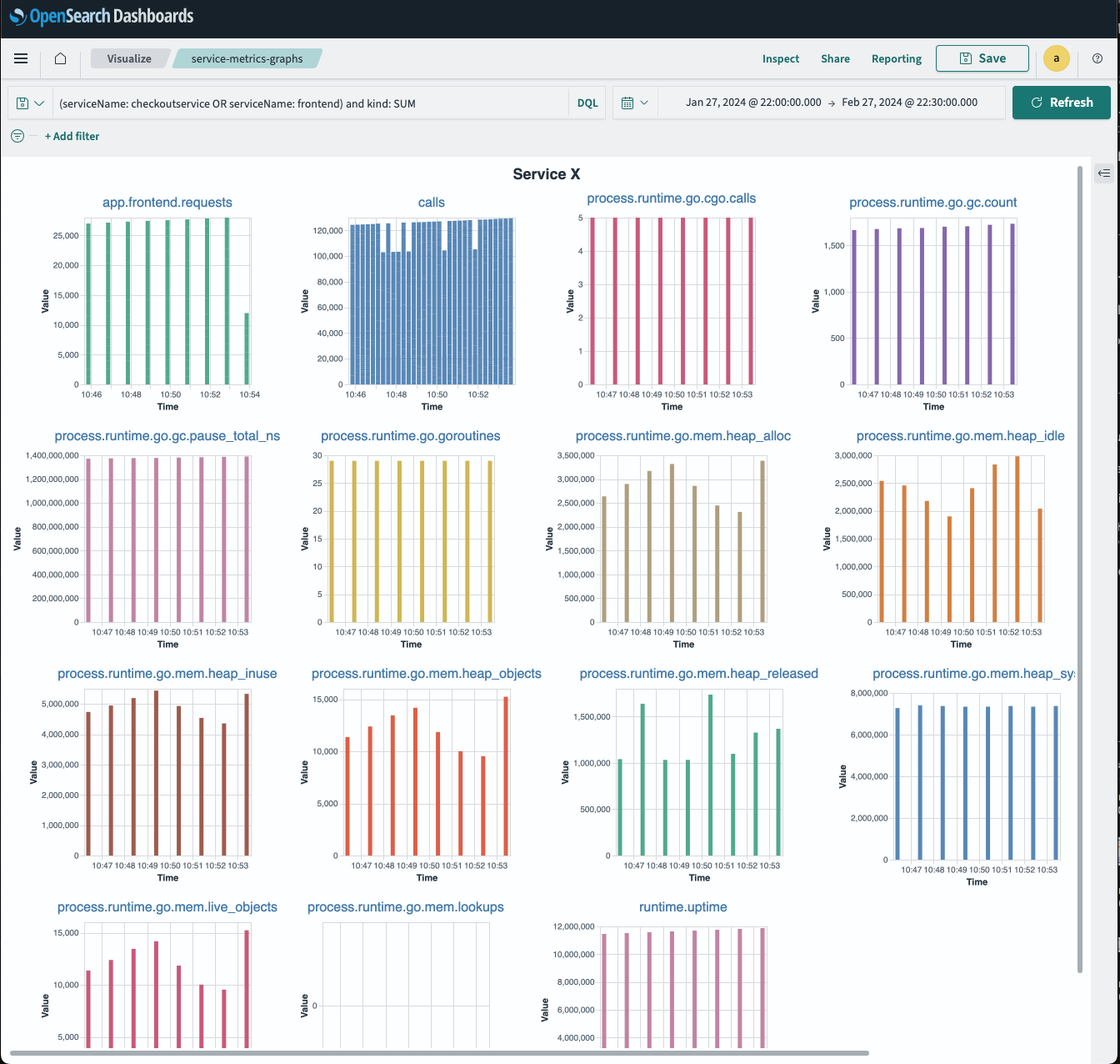
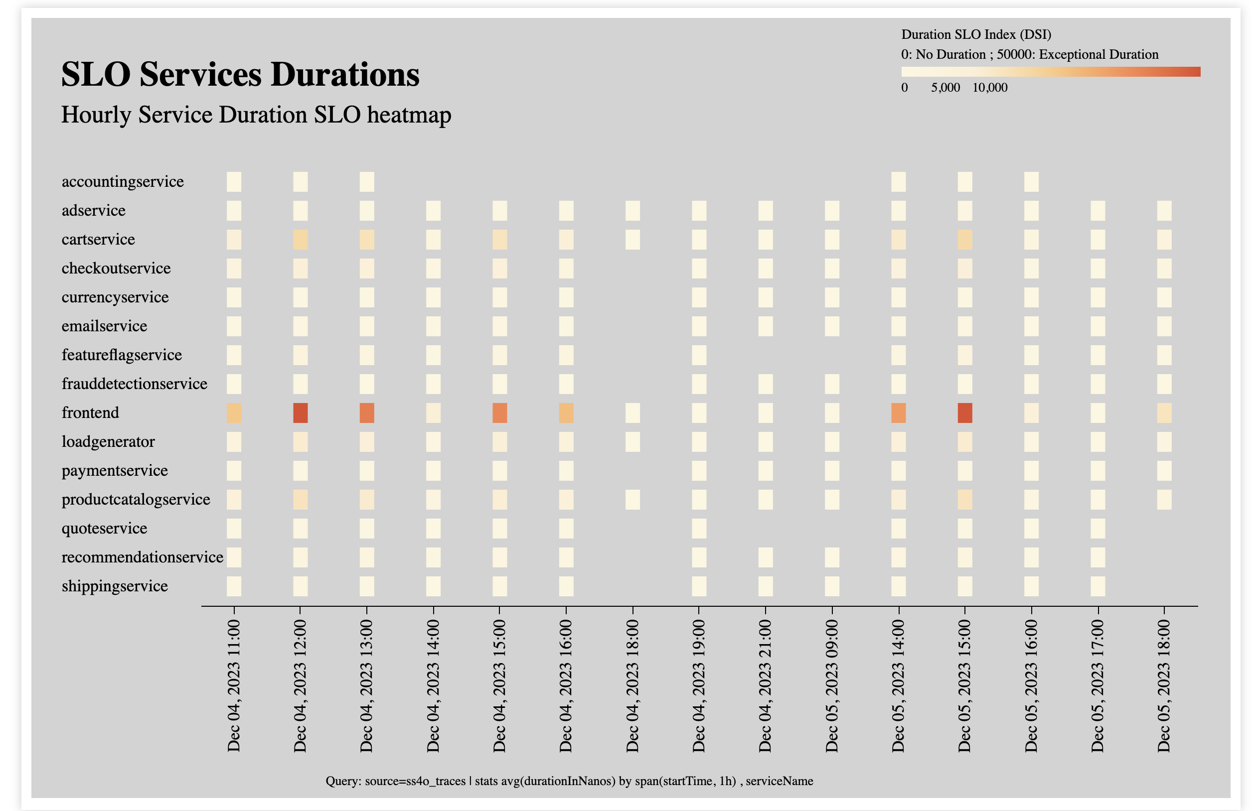
- Service Duration Widget
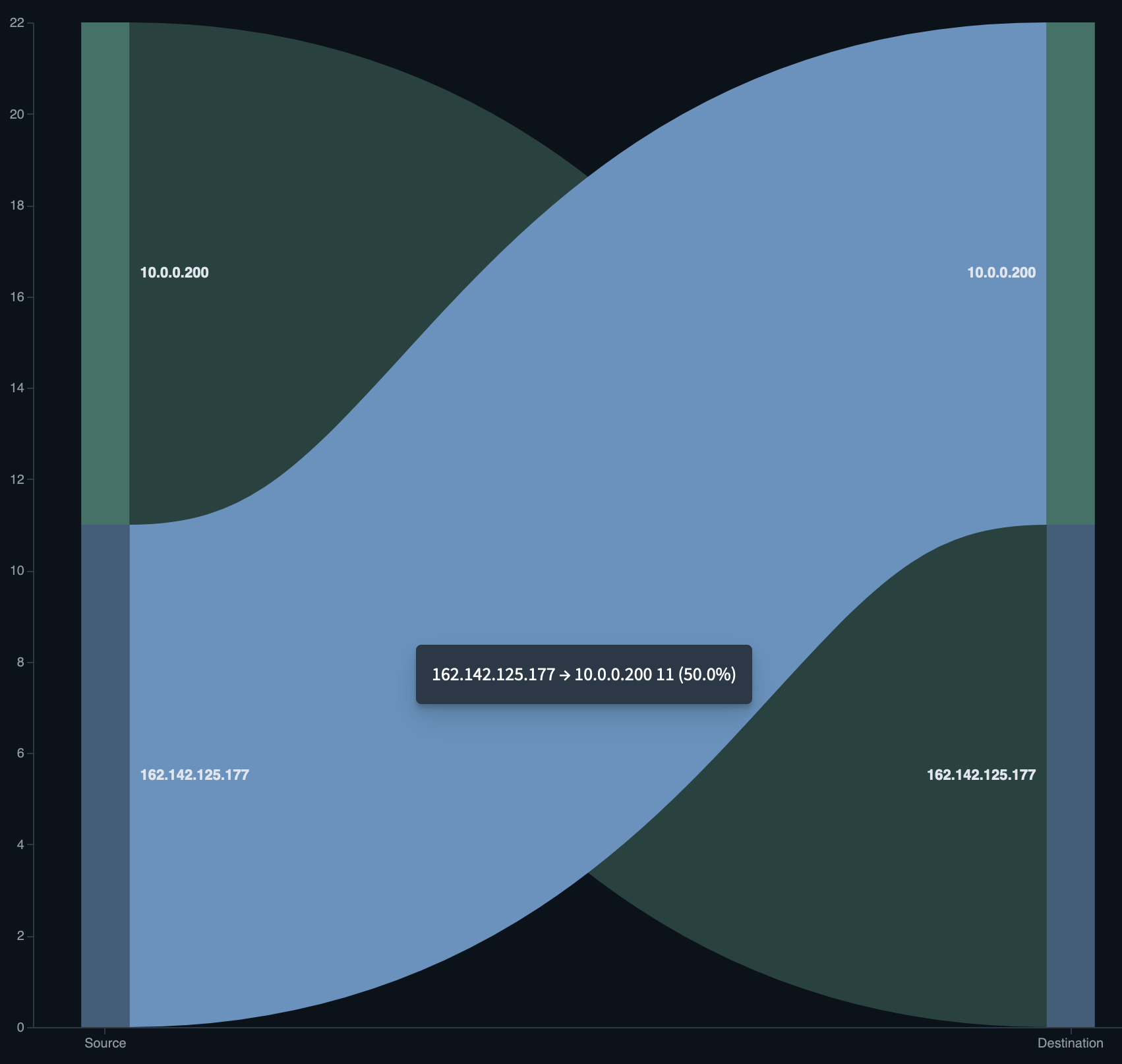
- HTTP Network Graph Widget
Using the tutorial and demo
Each of the above visualizations provides a detailed description of its usage and structure and contains the following parts:
- Introduction: Explains the domain-relevant visual context
- General info: Provides general information regarding the use case for the visualization
- Visualization structure: Details the visualization structure and its parts
- Data model: Describes the Vega specification data model
- Widget queries: Details the queries used by the widget
- Screenshots: Shows the widget screenshots or visualizations
- Prerequisite: Defines the expected indexes and schema
- Try me: Links to a prefabricated Vega staging environment with sample data
This rich support was created to allow easy adoption and to create a supportive atmosphere for community contributions.
Vega linking tutorial
As part of our continued effort to improve dashboard visualizations, we’ve created short tutorials that better explain usage best practices and provide recommendations:
In many cases, it’s important for users to create the flow behavior of an application, which includes a fluent navigation from one perspective to the other by simply pressing a button or selecting a visual component.
OpenSearch Dashboards doesn’t allow this naturally and requires some tweaks to achieve this. This next tutorial will show you how to do this using Vega widgets.
Summary
As we’ve detailed above, our goal is to simplify and improve the builder working environment to allow simple and comprehensive support for general use cases.
We encourage the community to continue this journey with us by developing the catalog so that it becomes the main entry point for developers and builders as they compose their next-generation toolbox for domain use cases. Please share your insights with us on GitHub or the OpenSearch forum.
Demo
Here is a short video combining all the Vega widgets and linking capability to formulate an observability use case.
Instead of having a static image of a network you can create a dynamic map that is reflective of multiple dimensions of severity of an incident